Re—brand for
Herbie
-
Strategy
Identification of Brand Strengths/Weaknesses, Social Media Strategy, Web Application
Rebrand
Logo + Voice & Tone, Brand Guide, Website
Brand Expansion
Iconography, Brand Photography, Templates
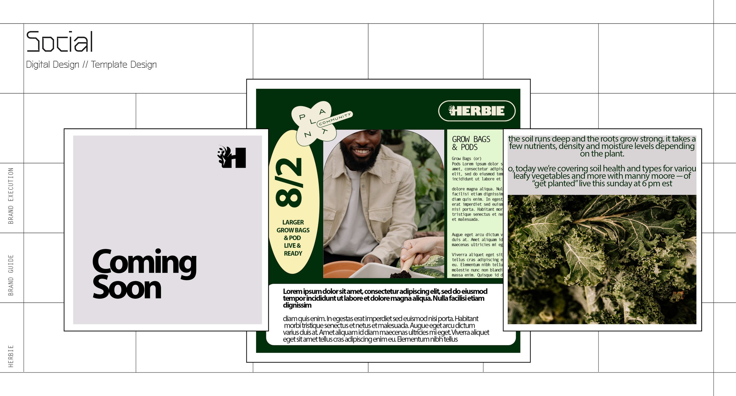
Application
Email Marketing, Social Media Design, Packaging Concepts
Photography
Brand Application and Brand Treatment
New Logo System & Design
╾
New Logo System & Design ╾
Inner — look
-
Herbie wanted a clean new look that embodied the brand’s growth and desire to build an internal community for gardeners and children alike.
-
We began with a brand and landscape assessment, researching adjacent brands, potential partners, and audience segments. From there, we developed a brand system and engagement strategy designed to resonate with adults—both with and without children—while also creating space for children to feel invited, included, and engaged. The resulting assets and touchpoints were designed to nurture each member’s journey with clarity and intention, strengthening the community as a whole.


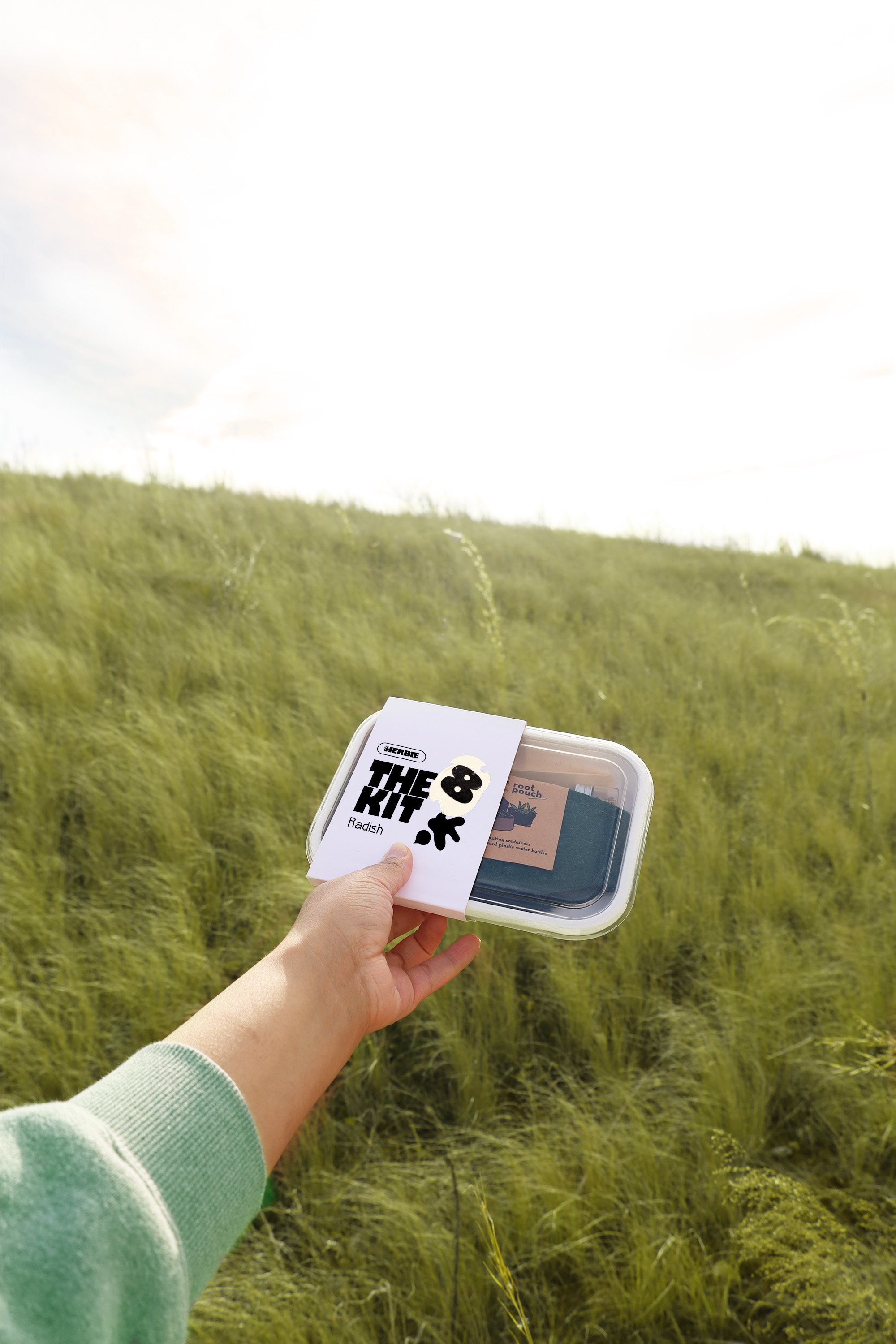
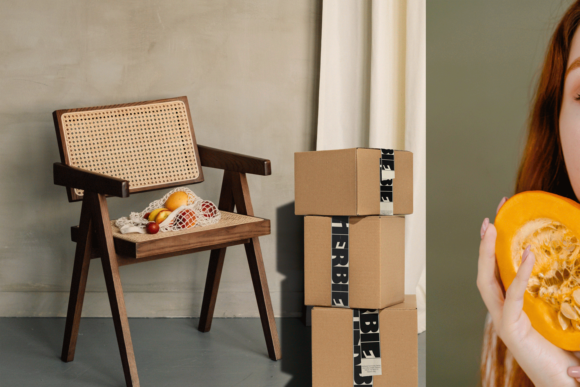
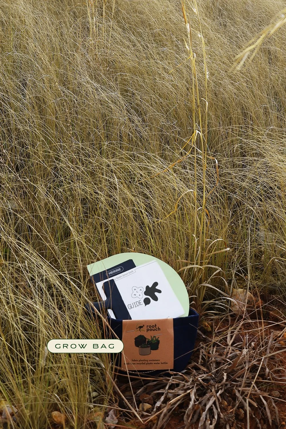
Packaging
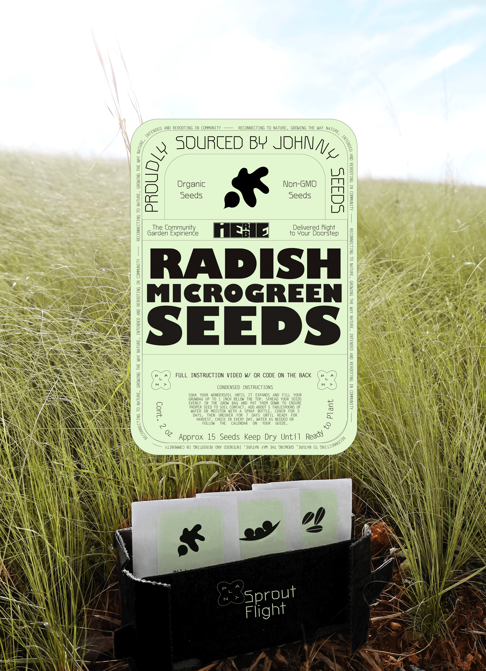
Using our new design elements as well as brand photography & physical mocks.
The Sprout Flight
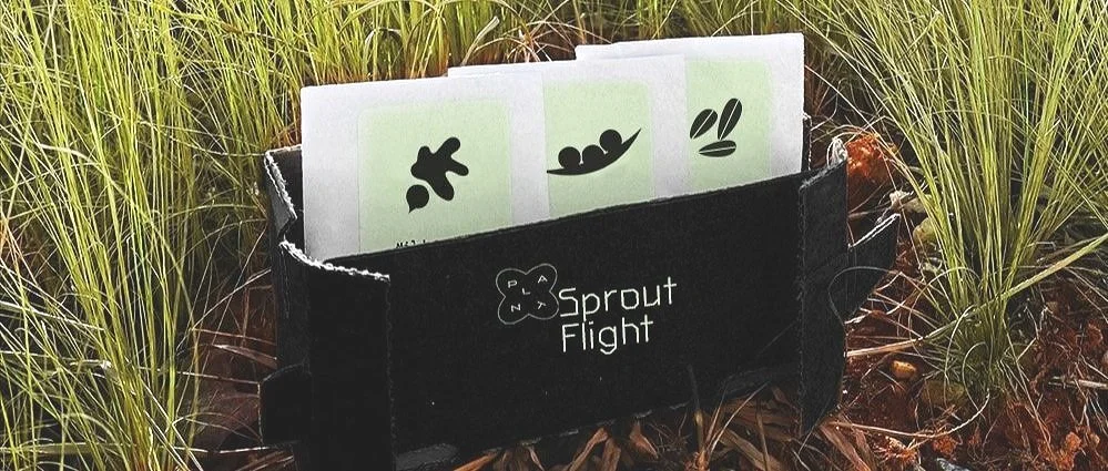
We used the idea of a whiskey flight - turned nutritious to match our client’s new voice and tone. The flights were designed for customers re-upping on seeds inline with an upsell strategy.

Iconography + Illustration
╾
Iconography + Illustration ╾


Icons & Stickers


Website Layout // Brand Application
→
Website Layout // Brand Application →
Brand Photography
Our Stylized Original Imagery
Mixed w/ Imagery Sourcing & Stylized Collateral Pieces